Typecase
Project Brief
My contribution
My Role
- Wrote usability testing plan and metrics
- Collaborated with customer support
- Ran testing session
- Analysed results
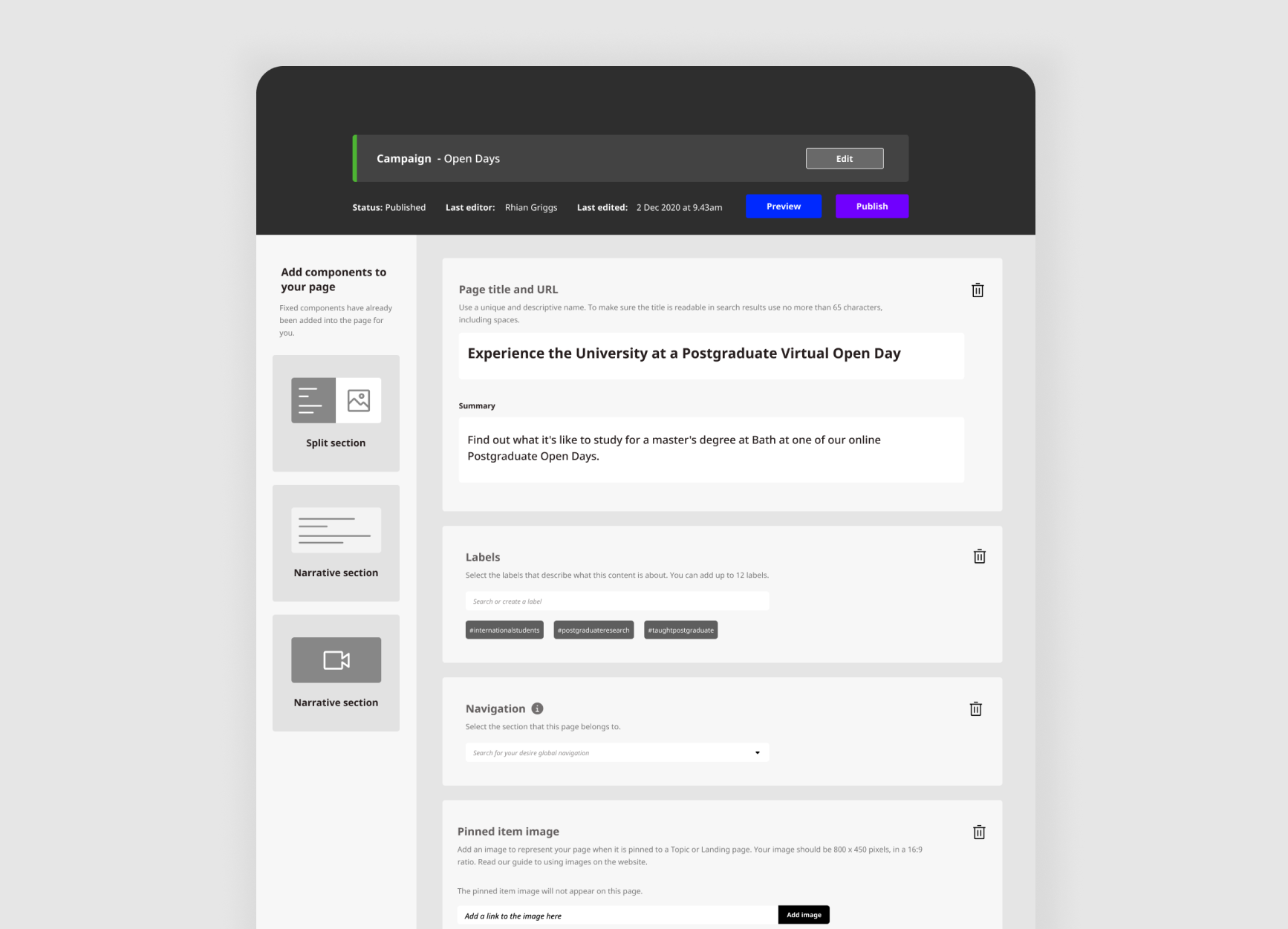
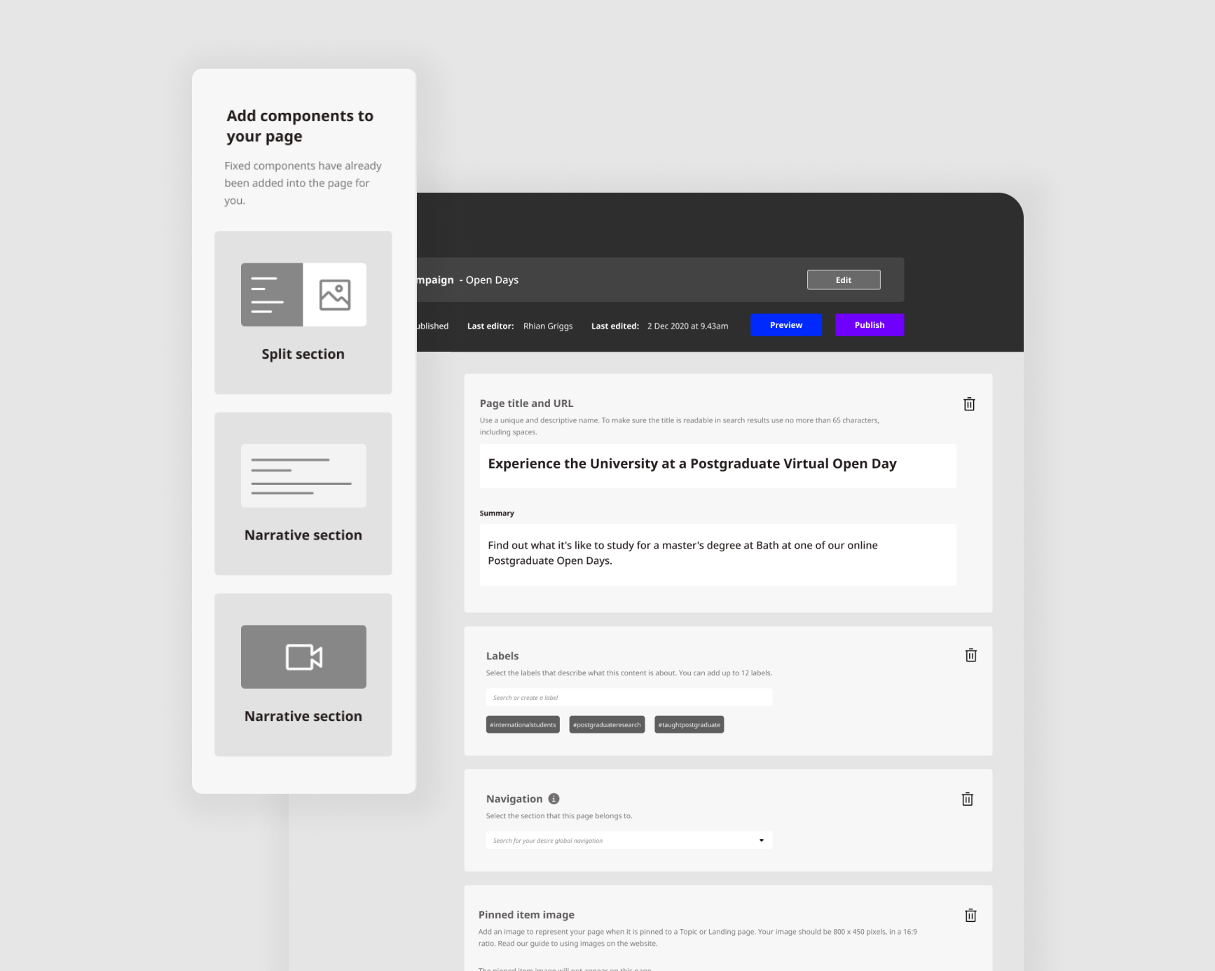
- Designed new interface
Team
- Myself
- Customer Support Staff
Tools used
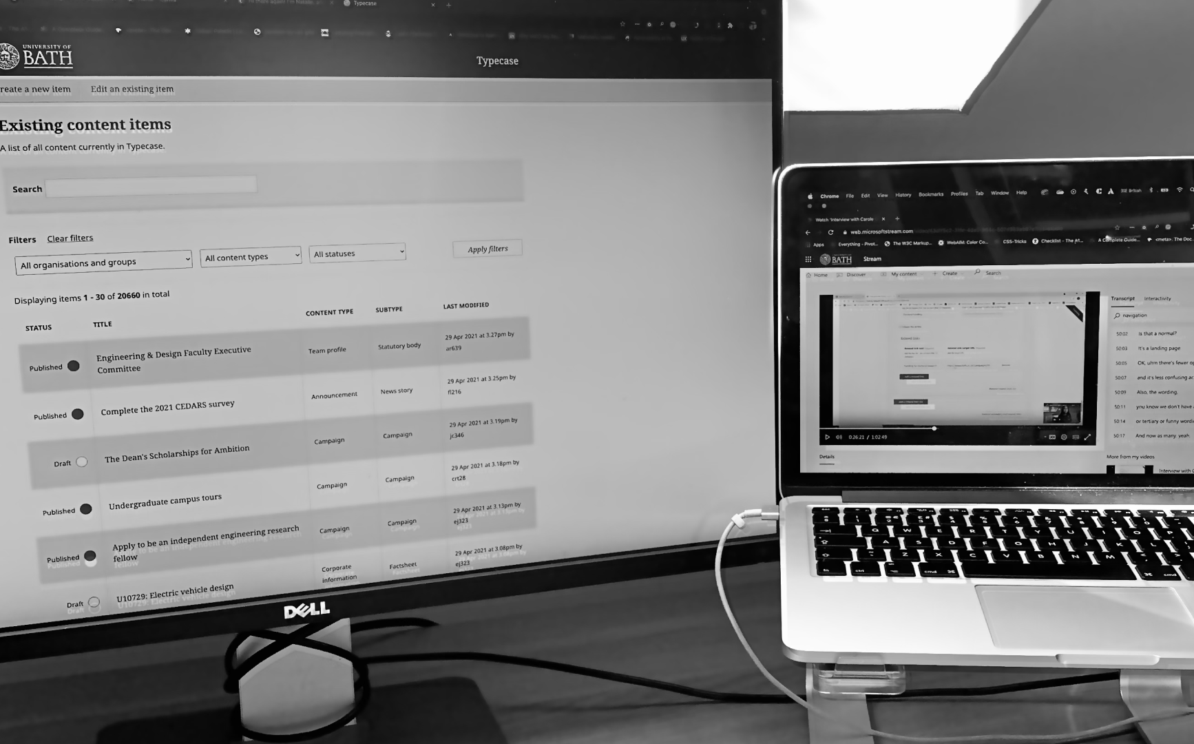
- Typecase testing environment
- Microsoft Teams
- Microsoft Stream
- Figma
Time spent
Journey
Set up
I began the testing by asking the customer service team for templates that have been frequently reported with repeated issues.
I then set tasks that closely resemble actions that Typecase users carry out daily.
I recruited six participants who have different levels of experience with the platform to reflect various groups of users from newbies to experts.
I ran the virtual testing sessions via Teams.
Metrics
90%
completion rate
70%
Error free rate
Critical errors
Non-critical errors
Key findings
66%
66%
66%
33%
6 mins
Most critical
Quotes
“...’cause I just filled it in. I assume that I've already added it...”
“It's a tree within a tree. You got primary links and secondary links and then tertiary links and then links list and related links list...”
Improvements
Adding more visuals
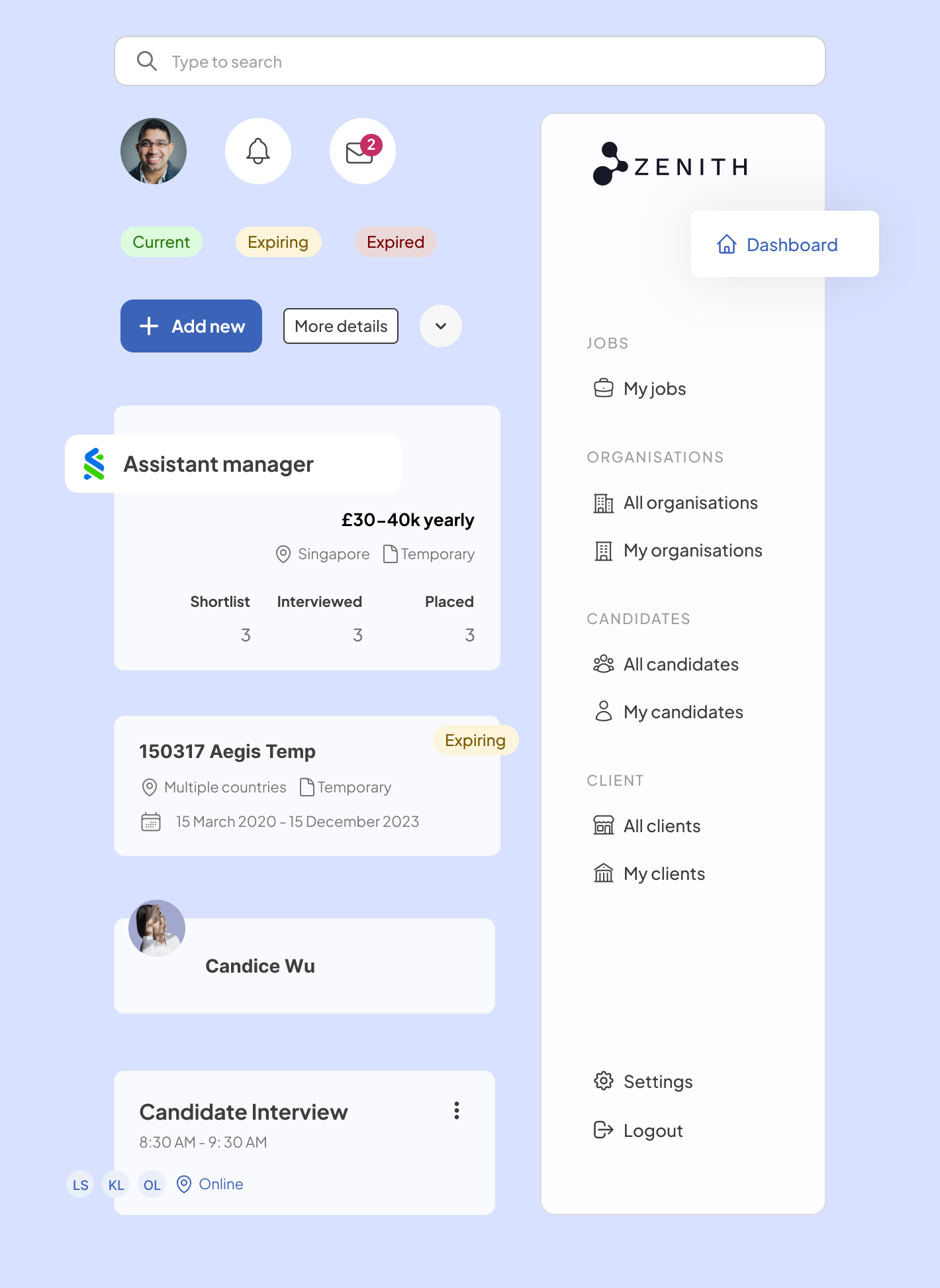
I decided to focus on improving the interface of Typecase by adding visuals to help clarify the terminology. Minimise information and make boundaries of sections clearer.
Reflections & Learning
I had a great time working on this project. It showed me how essential usability testing is when producing great experiences. It allows you to understand what your users’ frustration are.
However, it is important to make sure that this testing is used for improving the experience throughout the platform.
I look for forms in every application and website now. From the Webflow interface which offers so many options to Mailchimp which is more specific to just email design. The simpler the tool is, the easier the users can accomplish their goals.
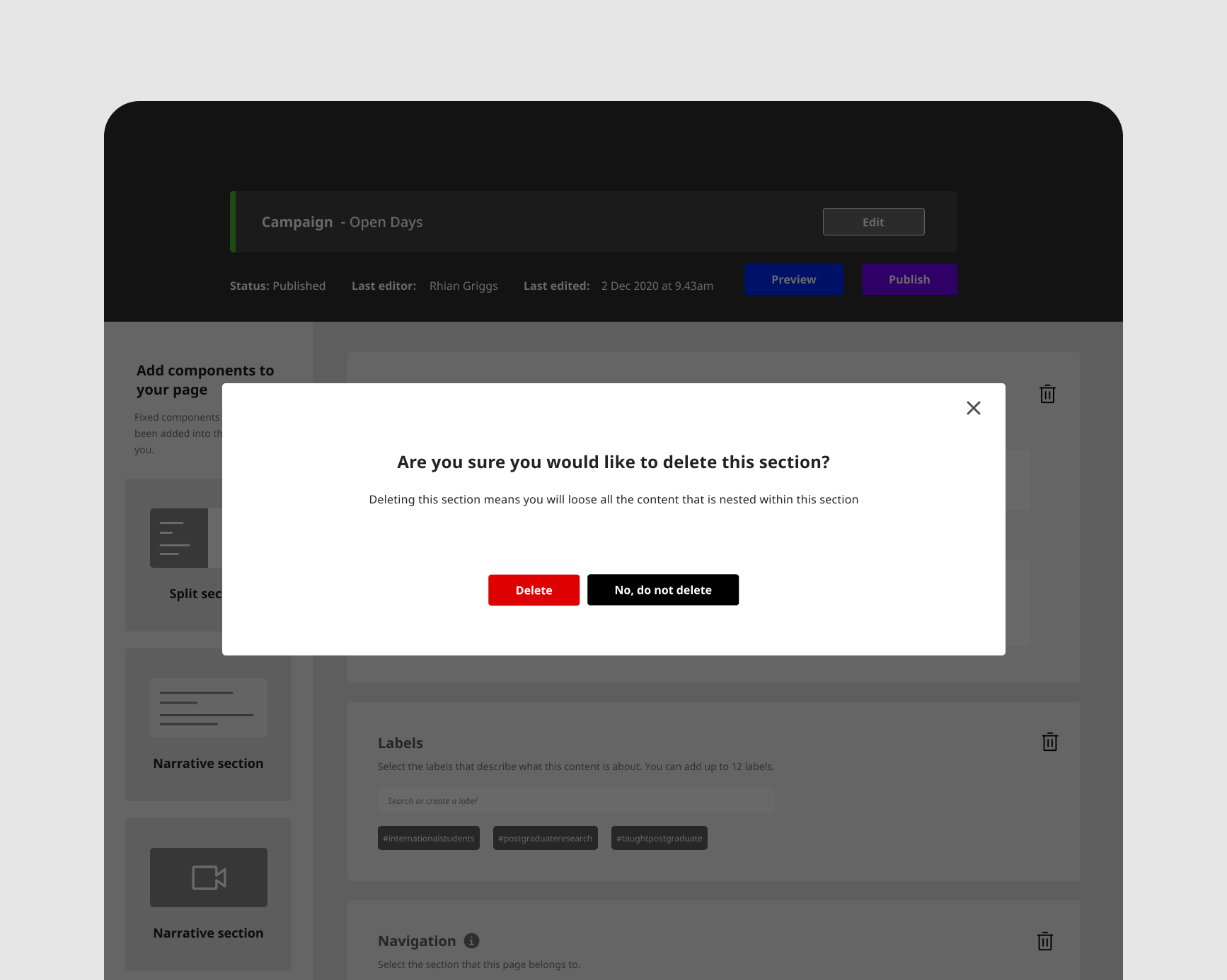
Pop-up
I decided to add a pop-up to warn users who have not saved their contact information before moving away from the section. This is a very important interaction. It is functional and also ties back to the core trait of the Typcase which is functional and trustable.
